Month: November 2015

Research into Film Noir fonts

Along with research about idents and shots, the font of the titles and the credits also have a major impact on the authenticity of the film. Despite the fact that I wasn’t present during today’s lesson, Molly and Finlay both spent their time looking into appropriate fonts for our genre/style.

According to this website that my group members found, http://www.sitepoint.com , some of the most stylistic features of a film noir movie are:

“Characterised by the use of abstract imagery, unconventional camera angles, stark contrast in light, overly-styled sets and characters as well as an over-theatrical approach, German Expressionism shares a host of similar techniques with Film Noir.”

In order to incorporate this effect into our film, we need to follow the conventions of film noir fonts. The website also said:

“The gritty gloom of noir dictates that your text will be lighter tones on dark. More often than not, this will be narrow, block sans-serif fonts-but there is plenty of room for variation.

Faux-3D text treatments are common on headings, but movies like “The Big Sleep” show that even a classic roman serifs can work in a film noir environment.”

Here are some examples of famous Film noir film titles and credits:


double indemnity

maltese-falcon-blu-ray-movie-titleride-the-pink-horse-hd-movie-titleblue-dahlia-title-stillborder-incident-title-stillgilda-hd-movie-titleseventhvictim-title-still

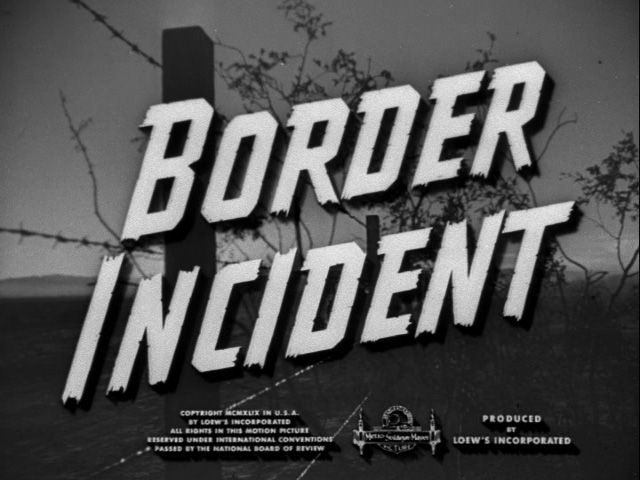
The fonts of text in Film Noir are usually very large and symmetrical. We took this into account when we came to make our text and title. The credits are also usually the same font but in a smaller size.

Storyboards

The research that was done on the storyboards was finally put into use by actually drawing the storyboards. The first bit of research that was incorporated into the storyboards was the aspect ratio. I asked my teacher if he could print of storyboards of the aspect ratio 4:3 and so he did and we began by writing down the last of shots we had planned. Molly, we decided was going to be the artist of the group because she could draw the best and this is shown by the clear and accurate drawings she has done underneath.

storyboard 1

storyboard 1.2

storyboard 1.3

storyboard 1.4

As you can see, the first two boxes are not filled in. This is because the first two boxes are the idents and at this point we hadn’t decided which definite ident we would be using in our film. The storyboards are of the whole film and in some boxes it was very hard to describe what was going on so we will be adding text underneath to show what will be going on more precisely.

The storyboards took Molly a couple of lessons to draw and some time outside of lessons to finish.  However when she finished them she showed them to our group and we all thought they were very good and well drawn. The next thing to do would be to add text underneath and then we can carry on with other pieces of research into our film making.

Idents software research

The last bit of research and planning that we have to do for the idents is to find software for it. So, I did just that. I asked my teacher in the lesson if I would be able to do a simple draft of an ident on Final Cut Pro, of which we used to edit our previous preliminary tasks. Final Cut Pro will allow us to make a simple moving ident that will act a first draft when we come to making it.

fcp_colorboard_big-1

He also informed me of another software called Motion. Motion is more complex than Final Cut Pro and gives a better result in terms of picture. Motion also has more options to make the end result more accurate. It will be likely that we use this if we have the time to learn how to use it properly.

apple-motion-5

The last software that I was told about was given to me by my friend Lisha. She told me of an app that you can download on iPhone, which is called LogoScopic. This app as far as I know can be downloaded on iPhone but I may be able to find another for android. However, using an app on our phone may be very unprofessional and may make it look very fake and messy compared to the software I have previously mentioned.

We will further be discussing the design and creation of the idents and working together to make it.


Idents draft

During a lesson, when my group were busy doing storyboards, blog posts and research, I was given the role of drawing possible ideas for idents. Based on previous research about popular idents, I designed them similarly to the research and also linking it with out genre and style of film.


idents 1

This drawing of the clapper board and the film reel is reminiscent of typical film equipment and stereotype.

idents 2

This design is by far my favourite because the cocktail glass is representative of typical props in Film Noir and I also incorporated the film reel into it to make the two objects link together. The cocktail glass also “captures the essence of the femme fatale and her archetype”, as said by Finlay.


Femme Fatale: Makeup and Hair

Yesterday, Molly and I did a practice of how we could use makeup to become a “femme fatale”. Molly already had the makeup to do it and whilst she was applying the makeup to her face, she took pictures of the process. They are as follows:

wp-1448613463451


wp-1448613529666

wp-1448613565363

wp-1448613653435

After Molly had done her makeup, I experimented with my hair to style it in a 1940’s way by curling it and making it wavy. I also had to give myself a side parting so that my hair would cover my face so that it gave a slightly ambiguous effect.

wp-1448613819294


wp-1448613827312


Prop & Costumes

In the lesson today, Molly was assigned the task to list the props and costumes that we will be using in our film. Here is the list:

  • Cocktail Glass- this of which we can access courtesy of Molly.
  • Cigarettes and a lighter- this we can also access.
  • Hat stand- this is for the trilby hat we will be using for the detective.
  • Long coat- hopefully we can get hold of a long trench coat, which will be worn by the detective.
  • The detective’s hat- this will be shown being taken off the hat stand and also the being worn by the detective.
  • Ladies necklace- this is for the femme fatale, who will be putting it on the in  the shots with credit over the top.
  • A red dress- the colour red implies has connotations of danger, lust and seduction, all of which come under the manipulative power of the femme fatale.
  • Dressing table- this is also for the credits scenes towards the start. In this mirror we see her brushing her hair.
  • A hair brush
  • Lipstick- this, we have. We will be using it in the credits scenes and it will be twisted up and being applied by the femme fatale.
  • Newspaper article- this is very important because the newspaper will establish the crime gangs in the city and it will tell us of the detectives objective.
  • Suit and Tie- this will also be worn by the detective, underneath the long coat.

Script: Draft 3

The second draft that we did for the scripts were not fully finished we realised and so Finlay made some extra changes to it, such as location, date and interior/exterior location. Here is the final draft:

script 3.1

script 3.2

script 33

Ident Research

An ident is a moving image that is production company logo. Idents are shown at the very beginning of the film to establish which company has produced the film and so this makes it more familiar to an audience.

Examples of common idents are 20th Century Fox, Paramount Pictures, Walt Disney, Lionsgate, New Line Cinema, Warner Bros and Universal.

20century

paramount

disney


lionsgate


newlinecinema_09

warnerbros

universal

Purpose of idents:

The reason why we have idents is because they are designed to give an announcement as to what kind of film you are watching. The idea of a production company having their own logo/brand gives them a sense of uniqueness. Also, the ident is a moving image, therefore is it starts the film off as a film and engages the audience to inform them the film is beginning.


Storyboard Software research

In my previous blog post I talked about what storyboards were and why they were useful when it comes to planning for film making. Instead of just drawing a storyboard on paper which we are usually used to, I have researched storyboard software that we can use to display the scenes on media.

In research of storyboard software I found some useful sites that will help us:

Storyboard That, here is a picture of a template of their storyboards:

story-boarding-for-mortensen

Celtx Storyboard, here is a picture of their storyboard:

celtx-storyboard


Storyboards: Purpose & Form

Storyboards are a “sequence of drawings, typically with some directions and dialogue, representing the shots planned for a film or television production”. Here is an example of what they can look like:

albert_1

Why are they good to use?

Storyboards are good to use because it allows the illustrator to experiment with changes in the story line which may reflect on the audience’s emotions/feelings. Storyboards are also good for films that are showing flashbacks because you change the pictures around in a non chronological order. Storyboards are used because they outline and show what exactly will be seen in the frame of the camera. Not only do storyboards do this, they also allow film directors and cinematographers to visualise any potential problems they might encounter and so it ensures they fix these problems to make the film/scene/play etc as well done as possible.

Form:

Storyboards take the form of grids of boxes. Each box represents a scene or, usually in bigger film production, a second of the scene. This is so there is a clear representation of what exactly is going on and it ensures that all the action matches up with each box. Under the grid of the storyboard, there is space for text underneath, which states what action is happening and any dialogue that is being said at the time of that action.